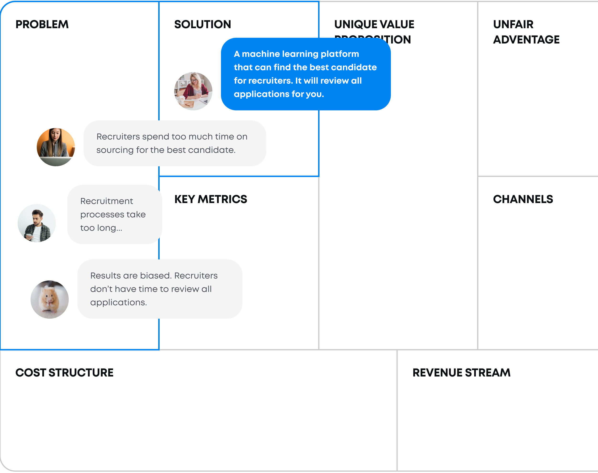
The product was a web application for recruiters. It automates the process of sourcing by machine learning matching candidates for available job offers.
I set up calls and short remote workshops to get to know what are current goals, ideas, what is the business concept. Based on that I prepared the action plan executed below.


Business owners knew a lot about how a recruiter's life looks like, but they didn't know what is happening when a recruiter opens the app, how do they actually use the app.

Missed mobile version, messy communication between designers and developers and outdated corporate style.

Promising roadmap with ideas to evaluate.
We needed to get to know what is happening when a recruiter opens the app in the morning, what she or he does first, what next. I conducted a set of contextual remote interviews, so I could see how recruiters interact with the app, highlights problems and generate ideas for a bunch of new features.
Also, stakeholders wanted to extend the audience. They were thinking about introducing a new persona to the process - a candidate. As an IT specialist I knew a lot about that perspective, but to avoid biases I analyzed opinions on USA market and I conducted workshops with developers.


Mobile compatibilityBecause of doing the refactor of components to Angular Material, that was the best moment to adjust mobile. Recruiters checks emails on the go, make phone calls with candidates. I made checking candidates and job info as easily as possible on mobile.

Design systemDefining changes for the MVP won't be enough. Developers complained about inconsistency in the app, mixed styles, mixed libraries. I reduced the number of styles and components and adjust them to the Angular Material library. For new features, it reduced time spent on front-end development.

Visual UI enhancementUsers were happy with user experience on the desktop, but the visual design looked outdated. I didn't want to create too expensive solution, so I maximized the visual update with minimizing the effort to build it. Even small changes like refreshing the color palette or shapes can make a difference in emotional perception.


#mobile conversion increased #ux evangelization